Design Systems Part II Design Language
July 26, 2019

In part one we took a look at the foundations of Design Systems. If you haven’t read that yet, I suggest you check it out!
In this post we’ll delve into the foundation of a design system: design language.
“A Design Language is a shared vocabulary for design.” - IBM
What Is A Design Language?
A design language is the set of standards which guide the creation of a suite of products underneath a brand. I like to think of a design language as the personality of a brand or product and its corresponding visual design assets.
A design language is comprised of three facets:
- Guidelines
- Elements
- Components
You may see no distinction between elements and components within a design language or UI kit. I’ve made the distinction here to illustrate that some components are comprised of other components (elements). I like to call these composite components.
Guidelines
Guidelines are principles which describe how your design language should be leveraged to build products. It includes things such as:
- Accessibility
- Brand
- Typography
- Color
- Grid
- Motion
- Icons
Elements
Elements are basic elements that can be used to build more complex components. Some examples of elements include:
- Buttons
- Drop downs
- Input fields
- Radio buttons
Components
Components are more complex than elements, and can actually be built as a composition of many elements. Some examples of components include:
- Modals
- Tooltips
- Navigation
- Pagination
How Do I Build A Design Language?
If you’re building a design language from scratch, you’re in luck; it’s much easier to start with a blank canvas! But the reality is that most companies are trying to build a design language in tandem with a preexisting product.
The general flow for building a design language whilst maintaining a suite of products is as follows:
- Conduct a UI audit
- Establish component priority
- Solidify your brand identity
- Establish guidelines
- Build a UI Kit
Let’s delve into each of these a bit more in-depth.
UI Audit
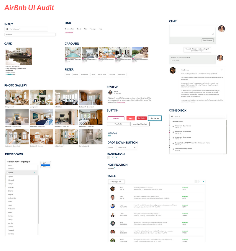
A UI audit is a visual inventory of all elements in all areas of your application, in every state. For example, how many different variations of buttons are there? Do their hover states differ throughout the product?
You can simply take screenshots of each component and add it to an art board in Sketch. It might look something like this if we did a UI audit for Airbnb:
Establishing Priority
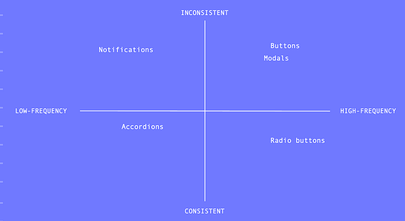
Once you’ve conducted a UI audit, you can start to prioritize components. We can do this by plotting each component on the consistency/frequency and feasibility/impact charts.
The consistency/frequency chart plots components based on how consistent a component is throughout a UI vs how often it’s used throughout your product.
Buttons, as we can see in the Airbnb UI audit above, are pretty inconsistent, but they’re used a lot throughout the product. In contrast, accordions aren’t used much (maybe in one or two places) and as a result are generally consistent.
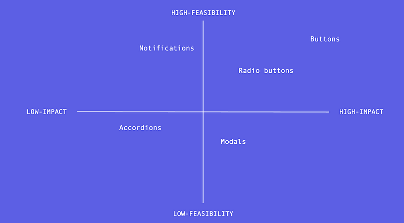
The feasibility/impact chart plots components based on how feasible a component is to design/develop and how much impact it will have on the overall product cohesiveness.
Going back to the Airbnb buttons, they’re pretty easy to design and develop in contrast to an accordion (which has a lot of moving pieces), and the impact will have a much higher impact on the product consistency.
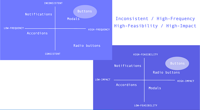
Once all components in the product have been plotted on these two charts, we can begin to create a prioritized backlog.
We want to focus on components which fall in the upper right quadrants of both charts: components which are inconsistent and used frequently, but are quite feasible to design/develop and would have high impact. These will yield the biggest return on investment.
Based on our Airbnb results, starting with the button components would be a good idea.
Once the components which land in both upper right quadrants have been tackled, your team can decide on the best way to proceed.
You might want to move on to components which are feasible, have high impact, and are used often throughout the UI, but might be more consistent than other components.
Solidify Your Brand Identity
Before you build a design language, you need to have a strong sense of your brand. How do you want your users to feel when using your products? These emotions need to be packed into your system.
Here are a few questions you might want to ask yourself in order to establish a strong brand identity:
- What emotions do we want our users to experience when using our product(s) (i.e. trust, adventure)?
- What is our mission?
- Why do we do what we do?
Establish Guidelines
Once you’ve established your brand identity, you can begin to define your design language guidelines. Here are examples of guidelines you’ll want to define:
- Accessibility: What level of W3C compliance must your system account for? How can we build this compliance into our system (i.e. color contrast, type scale)?
- Brand: What is your brand identity? You defined this in the previous step.
- Typography: What type scale and font family should we use to reinforce our brand identity?
- Color: What colors best evoke the emotions we want our users to feel? For example, blue indicates trustworthiness.
- Motion: How can we leverage animation and motion within our product to convey our brand?
- Illustrations: Where can we use illustrations within our product to convey our brand? What illustration style fits with our identity?
- Content: What tone of voice/persona will best encompass our brand identity?
- Iconography: What styles of icons will best fit with our brand?
- Spacing: What spacing paradigm do we want to adopt in order to create a consistent UI (i.e. padding, margin)?
Build A UI Kit
Finally, we’re ready to start building a UI kit. This is simply a kit of visual design/prototyping assets which embody your design language.
This kit will allow designers to leverage your system within their high-fidelity designs. Sketch is a popular tool for creating UI kits.
It’s important to create a strong, and organized, hierarchy for your kit. You may want to separate different component types (i.e. notifications, form elements, etc.) into different pages. Or, you may want to leverage symbols to ensure consistency.
Before designing your kit, be sure to create a “working contract” with your team to ensure you’re all on the same page when it comes to kit organization and workflow.
I hope part one served as good primer to design languages. Part three will cover Component Libraries. Feel free to let me know what you think about design systems down below.
All graphics are courtesy of unDraw.